THE WALL STREET JOURNAL
Homepage Redesign Discovery

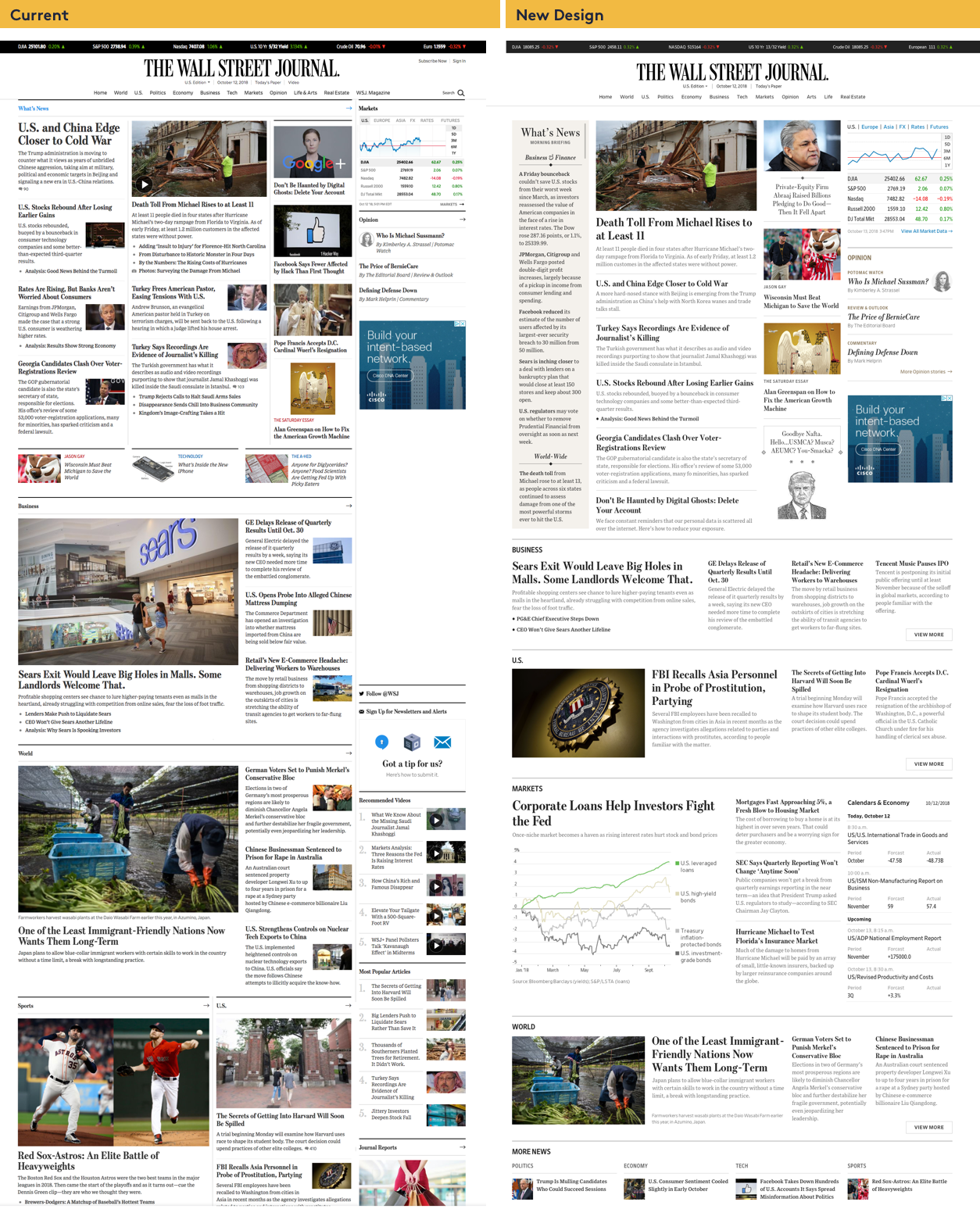
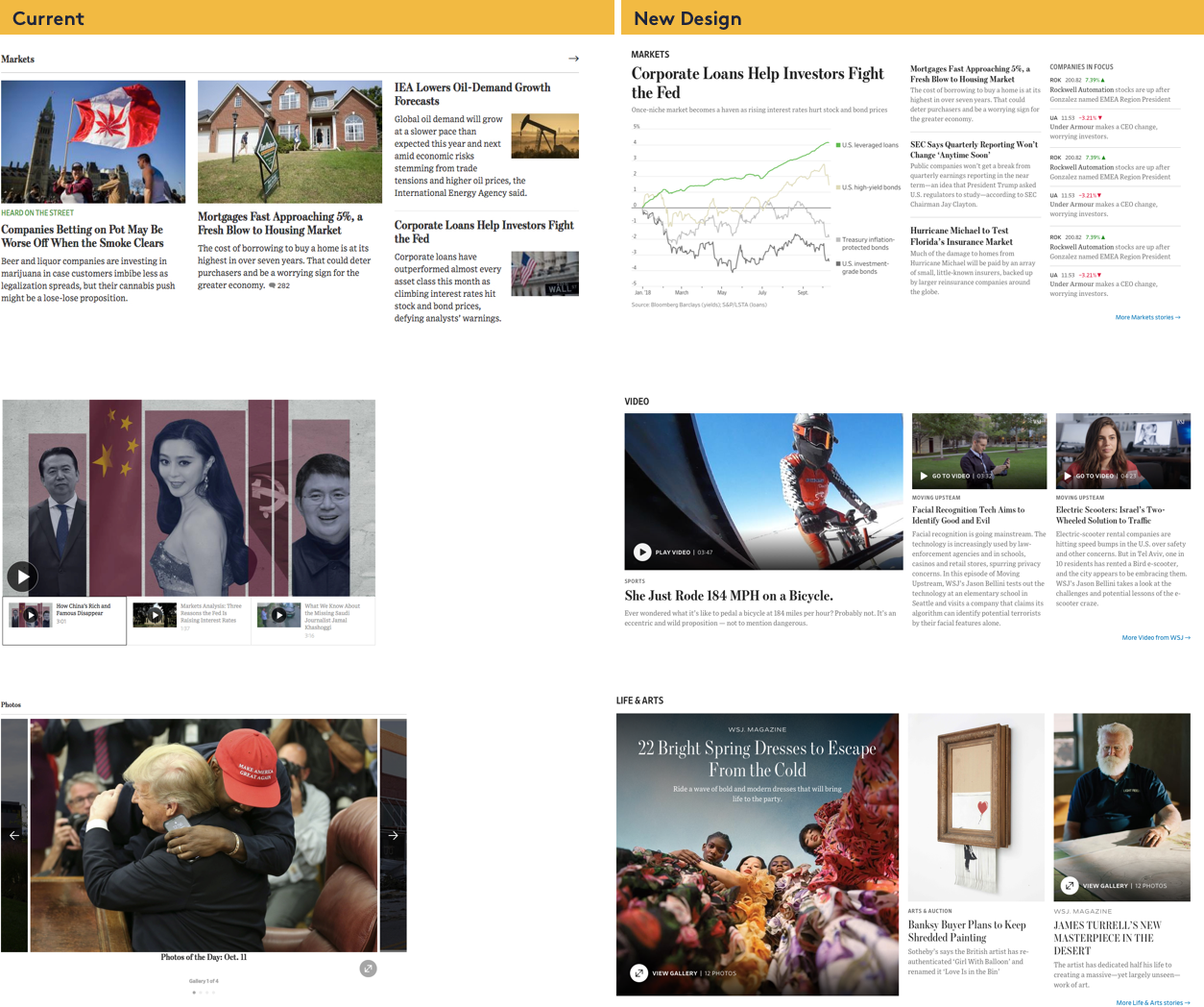
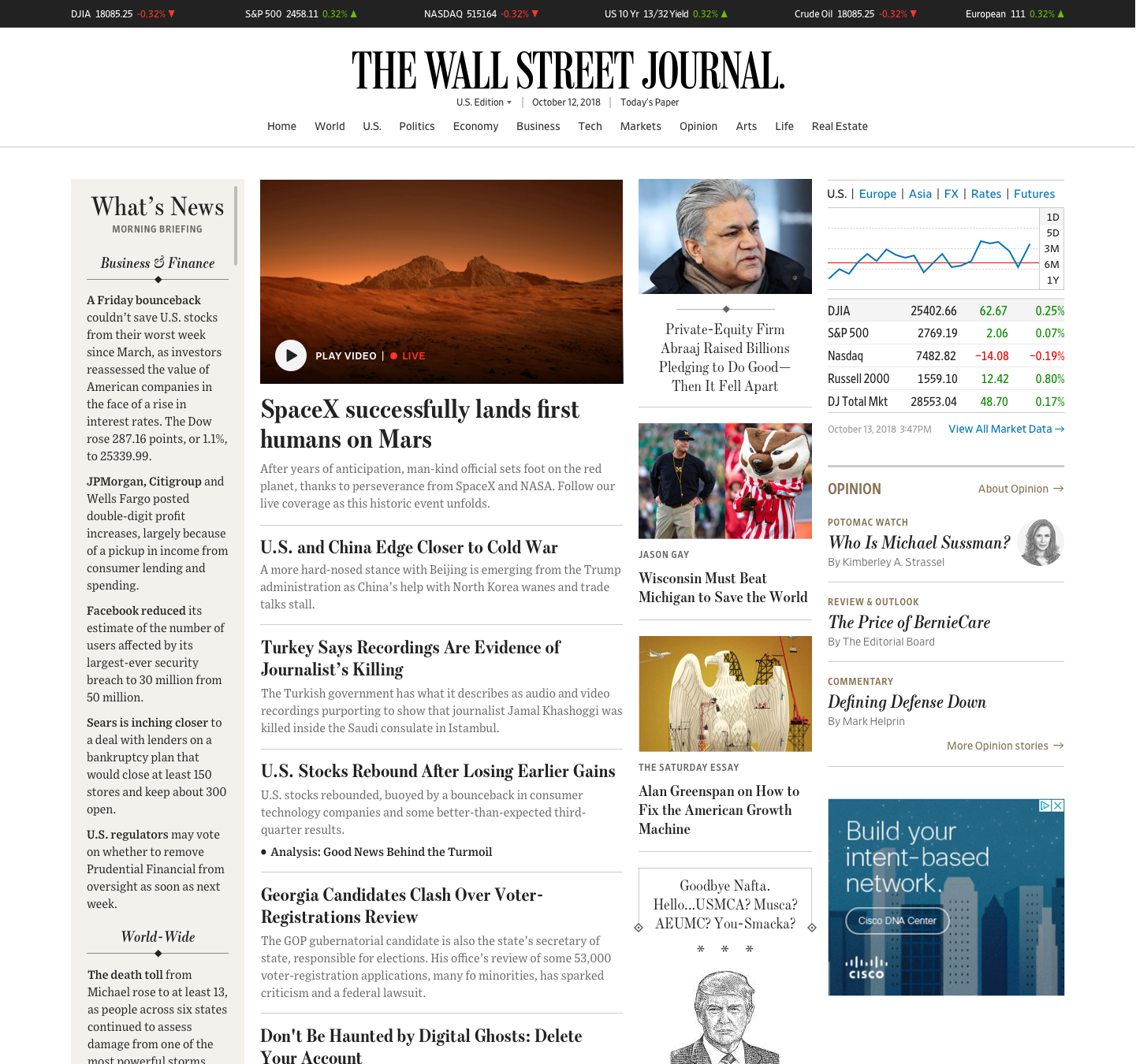
The goal of this project is to create a streamlined and premium homepage that reflects the variety of content and features offered by WSJ.
My role was UX research, and closely collaborating with product managers, newsroom editors, developers, and UI designers to define the end-to-end user experience and ensure UI accessibility.
"Too cluttered and no emphasis on what the top news stories are"
"They are boring!"
- current WSJ homepage comments by users
Objectives
The main objective is to better cater to two types of reading behaviors
- Skimming: By better catering to skimming to reduce user churn and increase ad capacity.
- Deeper reading: Provide user value and increase conversions by inviting engagement with homepage content when readers have time.
- Additionally, elevate WSJ brand to measure through user trust, how informed members feel, and perception of the brand as premium.
Research & Strategy
Collected data, analytics, and industry best practices to validate and inform UX decisions. Interviews were conducted with key stakeholders: internal newsroom editors, product managers, WSJ subscribers, and non-subscribers outside the organization. The interviews allowed me to step into the shoes of interviewees and see my role through these stakeholders. It also helped prioritize features and define Objectives and Key Results (OKR).

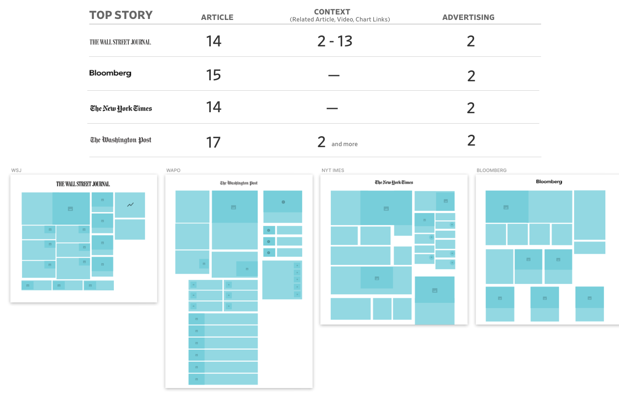
I looked at other major competitor homepages to study real-life examples of designs that gain ideas about how I can solve the issues for the homepage redesign.
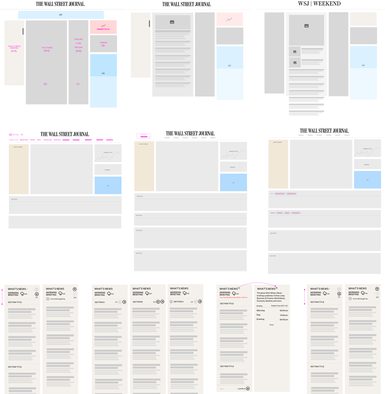
Low Fidelity Designs
Modular designs
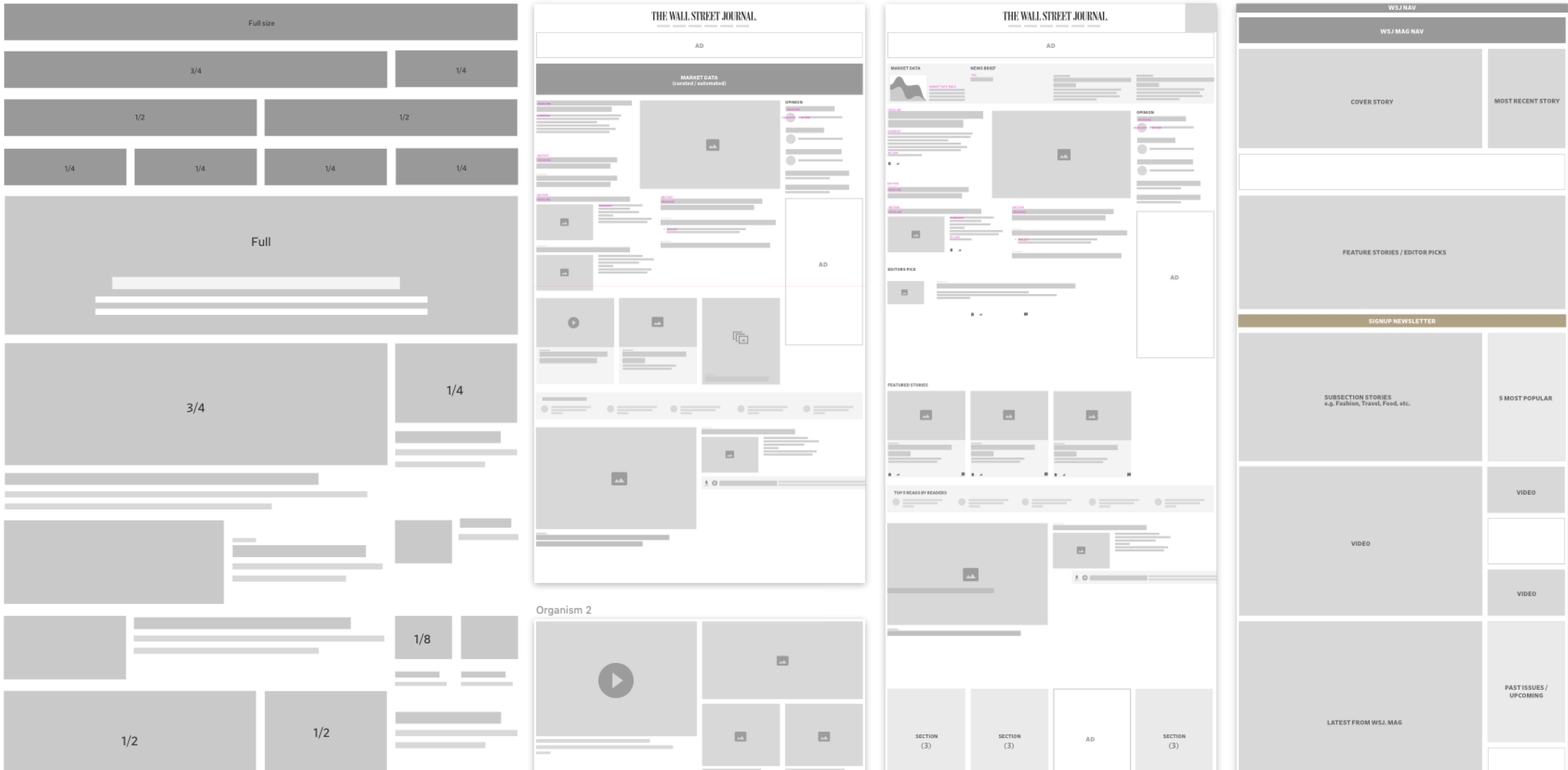
Schematics concepts
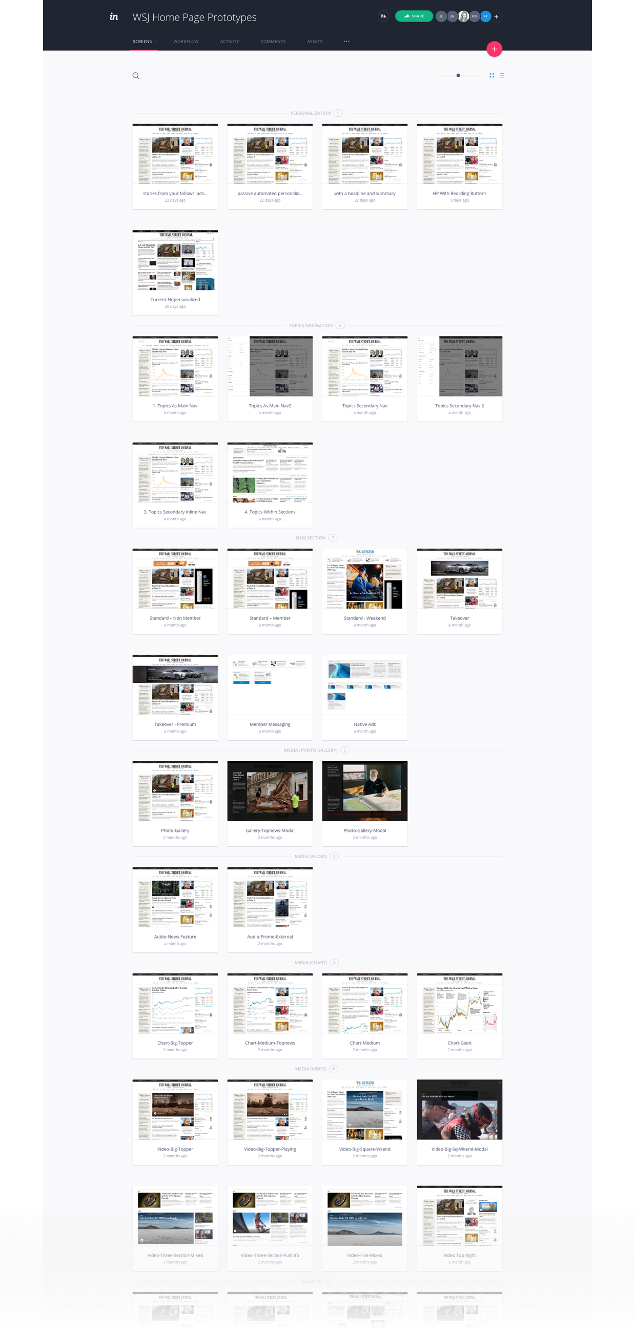
User Testing
Studies have been largely quantitative with 3,408 WSJ unique members in 7 user testings and some remote qualitative research via UserZoom that helps to understand human behaviors and diagnose development opportunities.
UX Analysis
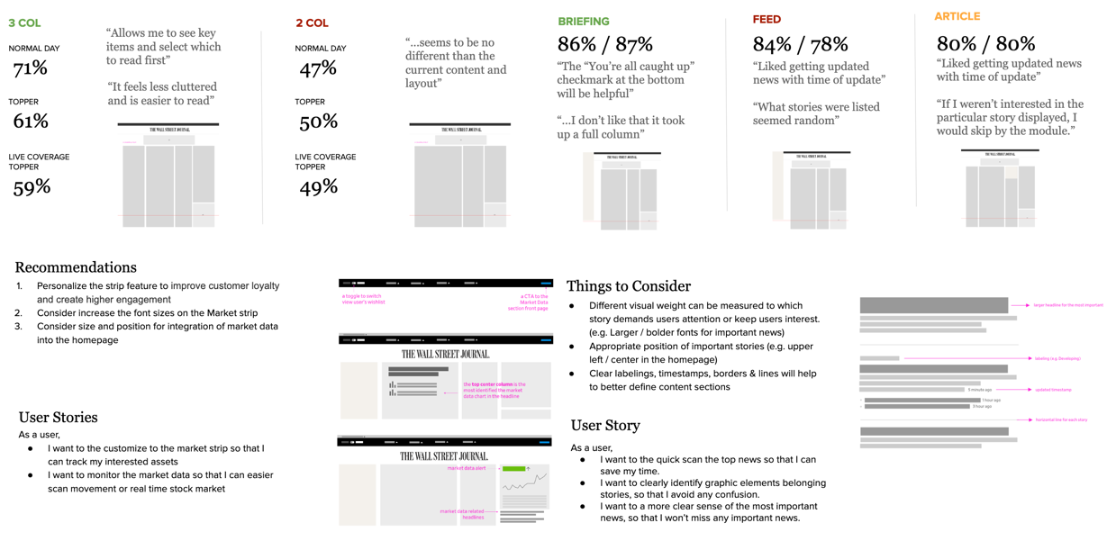
UX documentation Analyzed and provided UX recommendations and results of each user testing.
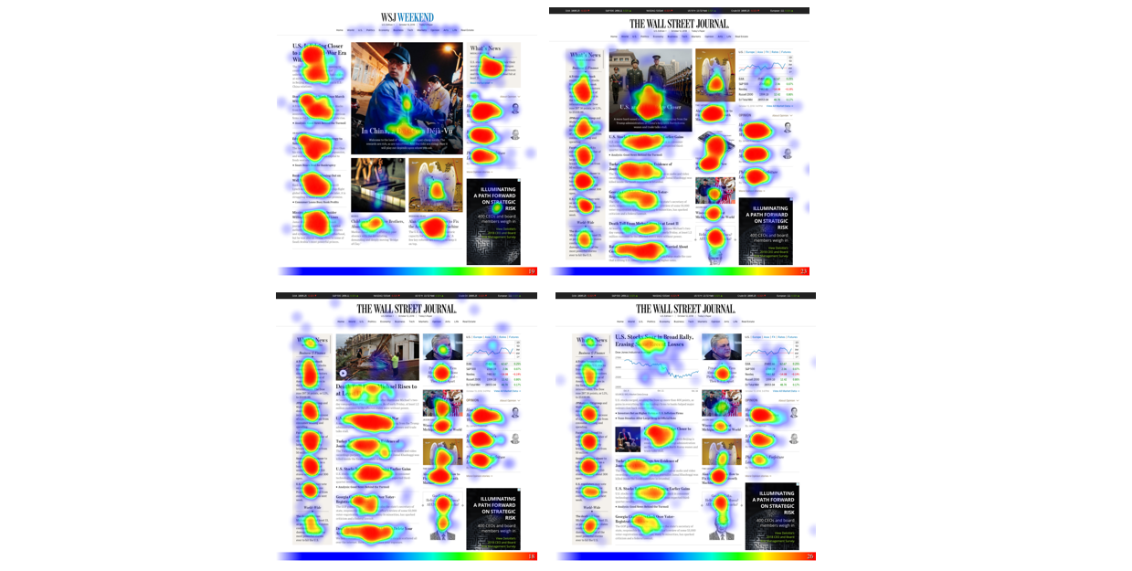
Results
"Allows me to see key items and select which to read first"
"I could quickly get current and then read further on the stories that pique my interest"
"Save time to major stories at a glance"
- respondents quotes from the user test
