AMERICAN EXPRESS
Membership Rewards
Membership Rewards (aka MR) is the destination within the American Express site where cardmembers can redeem their accumulated points for a variety of benefits, including gift cards, points transfer, and statement credit for individual transactions.
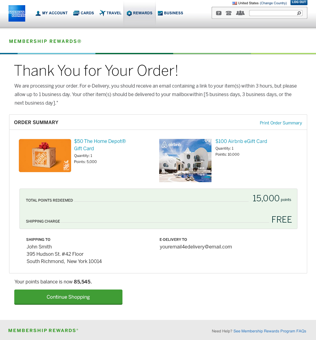
The main goal of the redesign is user-friendly flows, visual consistency in user interface design, and overall user experience to increase engagement.
Strategy
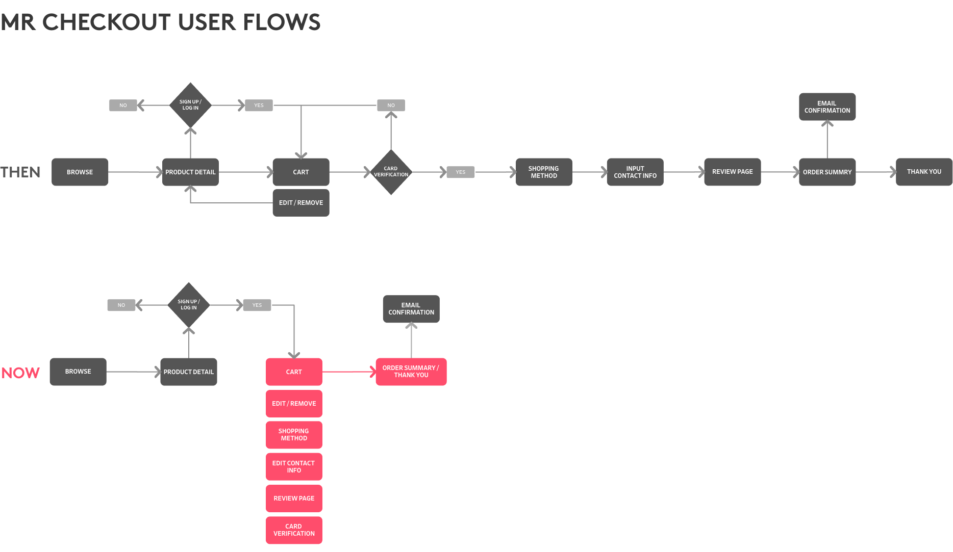
When I got the project the first time, the MR checkout process first time was too complex and inefficient. I was trying to take the opportunity to streamline the user flows, remove a lot of variances in the copy, and reduce the number of fields on the page.
Before sketching any ideas, I created user flows to help me understand how the user moves through the checkout. This helped me analyze every step of the task so, I could improve it and make it easier for users.
Discovery
Started off with whiteboarding sessions with my design team and initial paper sketches. This engagement leads to the discovery of more complex and subtle issues and conflicts during the design process.It allowed us to iterate quickly on issues that might otherwise not come up until very late in the process, requiring significant rework.
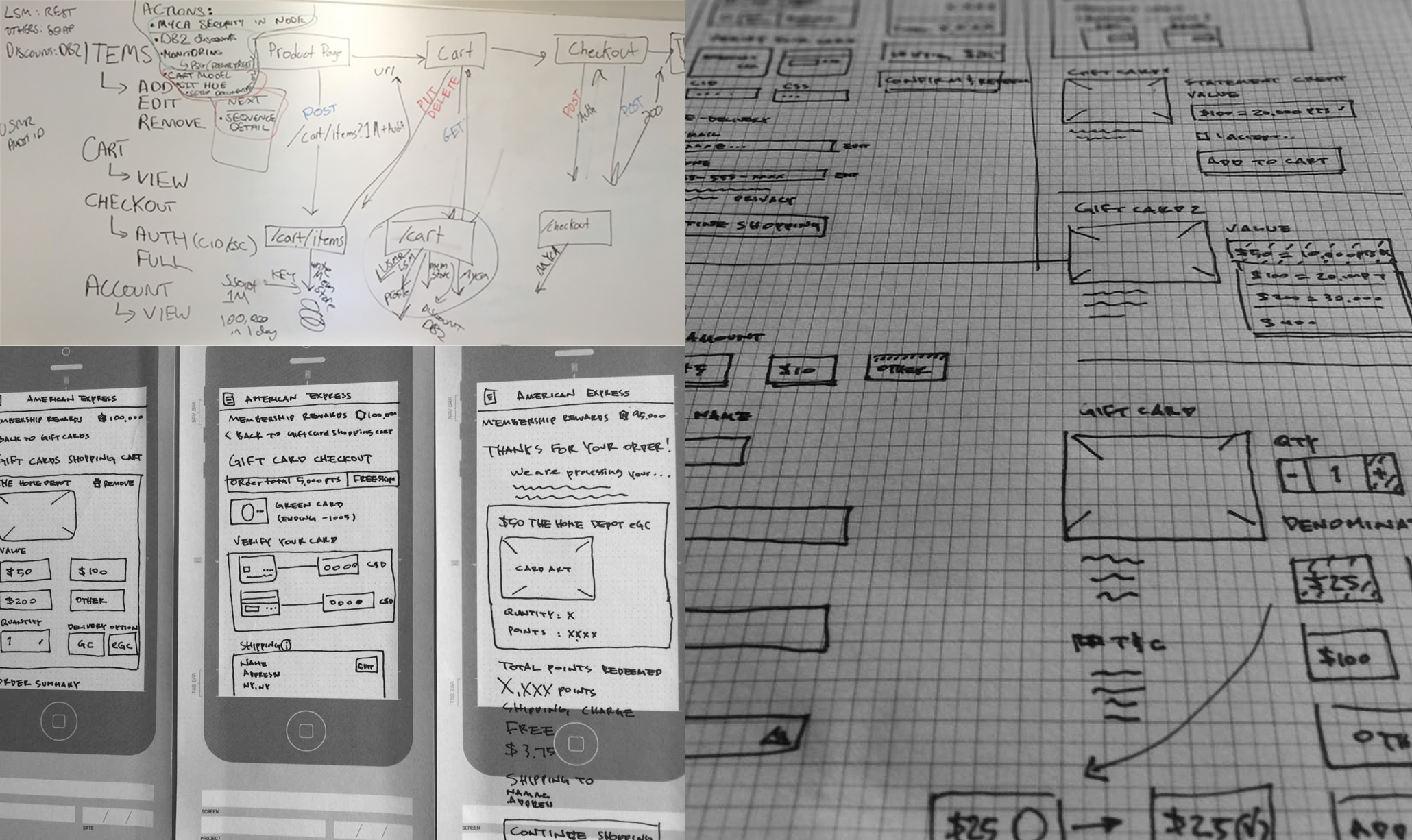
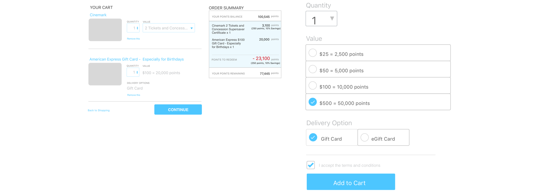
After many iterations, I moved my best ideas to create low-fidelity wireframes. I focused on:
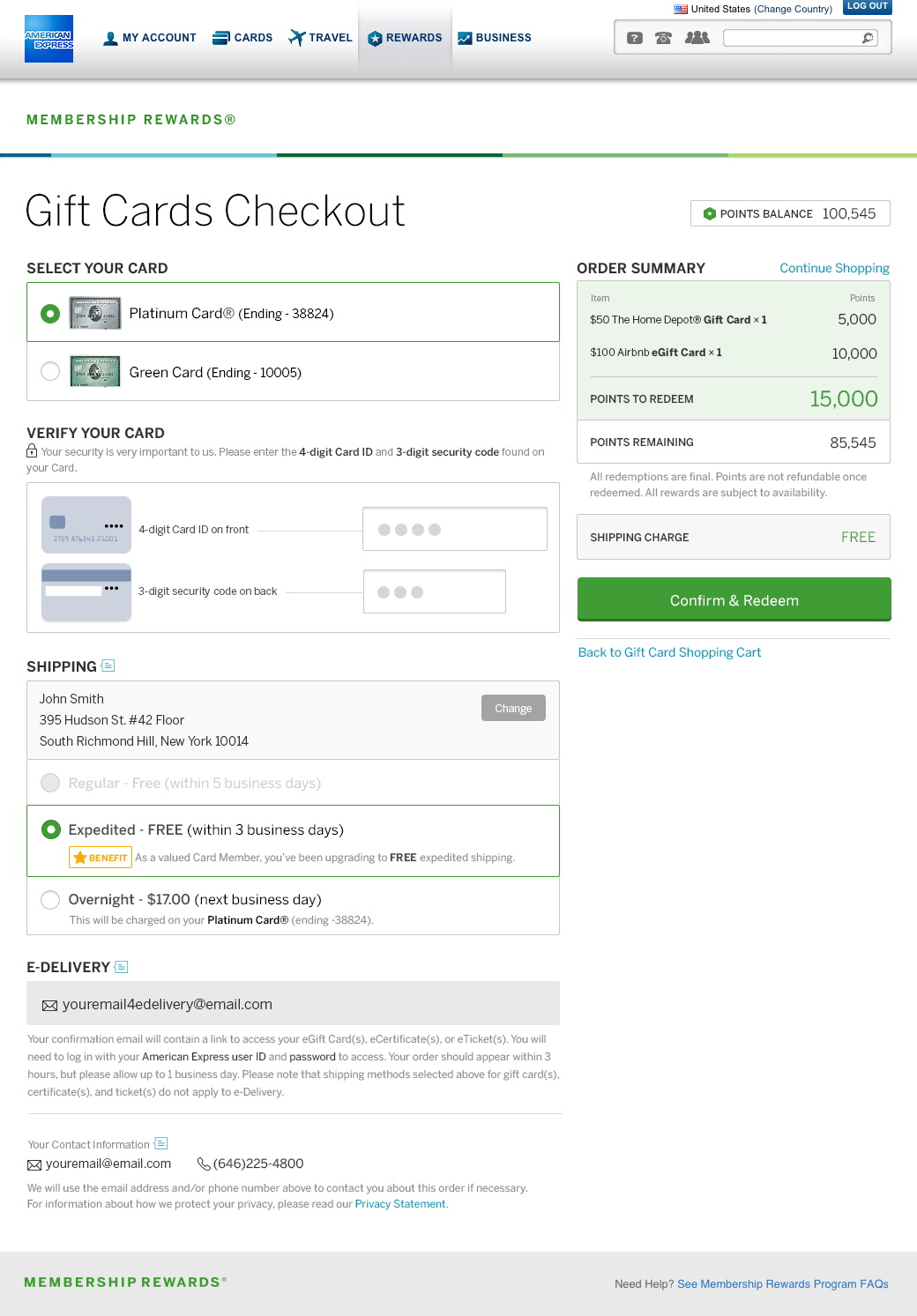
1. Single Page Check Out.
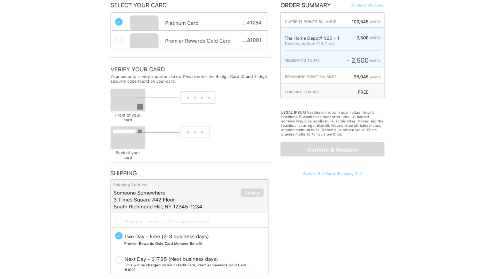
2.Editable Cart Items, price visibility throughout the checkout, and form validation.
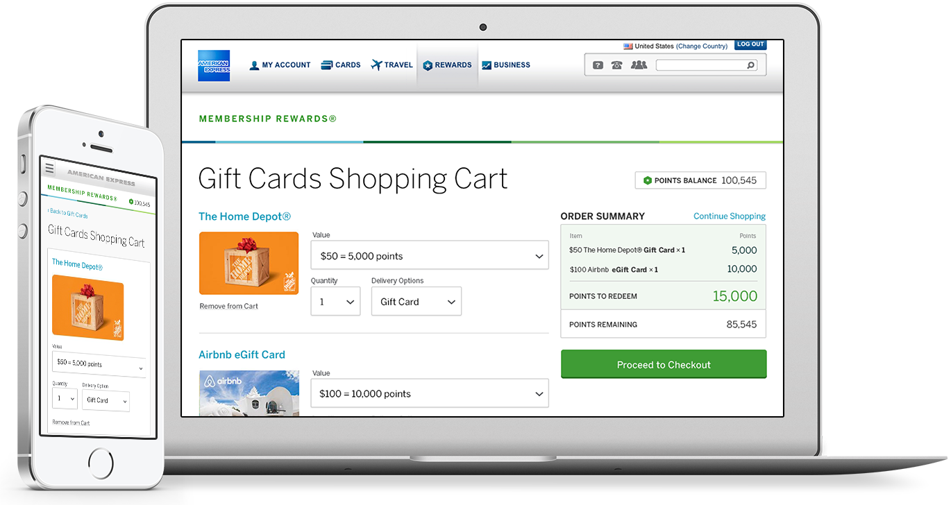
Results
My Role
As a Sr. product designer, I have been charged with the end-to-end process. For instance, researched, wireframes, prototypes, UI designs, and usability tests, and closely worked with the project managers and engineers by the launch of the entire project.
